
You're standing in front of the closet on Saturday morning with a pair of gold pants in one hand and a navy shirt on a hanger. You like both pieces. You're just not sure they belong in the same outfit, and you don't want to find out they're fighting each other when you reach the first tee. Gold is a bold choice, let's be direct about that. Paired by value, saturation, and finish instead of hue alone, it can look deliberate. Paired by guesswork, it won't.
Gold Pants Pairing Chart for Navy and White Camo
You're on the first tee in mustard pants, your playing partner takes a quick look, and you can feel the question forming. Did you plan this outfit, or did you get dressed in the dark? The shirt itself isn't the problem. A navy polo with white camouflage gives you one dark color and one light bridge color, and gold has to slot in beside both.
The Four Ways to Wear Gold With This Shirt
| Pairing type | Gold shade to choose | How it reads on the course | Best setting |
|---|---|---|---|
| Neutral | Soft champagne or light antique gold | Navy and white stay the focus while gold recedes | Daytime rounds and conservative clubs |
| Complementary | Deep mustard or amber gold | Warm gold against cool navy gives the strongest contrast | Bold social rounds and events |
| Tonal | Dark bronze or dusty gold near the navy's depth | One unified color family that looks polished | Clubhouse and dinner after the round |
| Pattern | Solid antique gold with no print | The camo carries the only pattern and the pants stay plain | Any round where the shirt is the statement |
Start with the row that matches the pants you already own. If you're buying new, I'd start with antique gold. It works in all four rows because it isn't too shiny, too yellow, or too close to khaki, and it forgives a mismatch when morning light turns flat by midday. Treat it as a starting point, not a guarantee. The final pick still depends on the exact shade in your hand.
You can think through the rest of the outfit using this guide to matching golf pants with golf shirts and hats, especially if you're deciding whether your cap should repeat the navy or stay white. If you're building matching looks for a group outing, it also helps to find the right sizes for everyone before you commit to one shade for the whole foursome, since a gold that flatters one player can wash out another.
One comparison makes the chart easier to use. The Camo Cool-Stretch Golf Shirt (White) keeps its pattern subtle with white-on-white detail, so gold pants next to it become the main event. Next to the navy and white camo, the shirt holds its own, so the gold needs to be calmer. That single difference explains why the same mustard pants can look sharp with one camo shirt and loud with another.
Golf-Appropriate Looks for Course, Club and Clubhouse
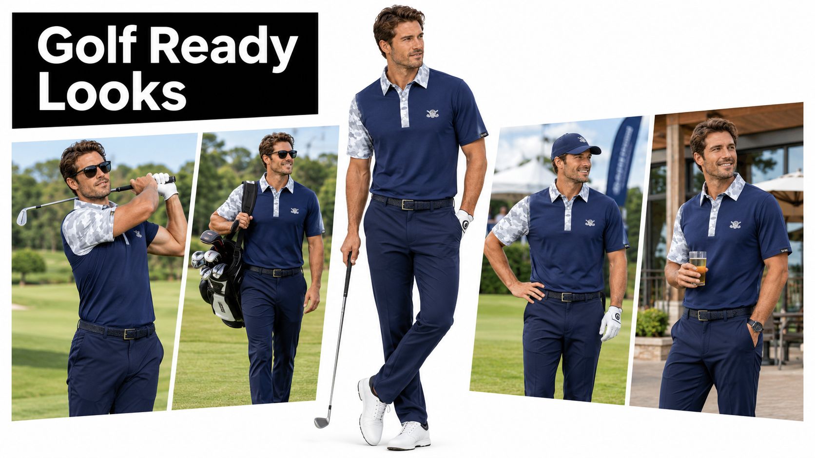
Say it's a Saturday club round and you want the outfit to work from check-in to the turn. You tuck the shirt in for a clean line and let the gold pants break once over the shoe, no pooling at the ankle. A slim belt matched to the pants' hardware keeps the waistband from looking like an afterthought. One loud piece is enough.
The Cool-Stretch fabric carries its weight here. It's lightweight, moisture-wicking, and quick-dry, so the shirt still looks crisp by the turn, and the relaxed polo cut reads classic even in a camo print. If you're unsure how far a bold pattern can go at your club, this explainer on whether bold golf shirts are allowed at country clubs is worth checking before you book a guest day. The same discipline applies off the course. Groups ordering branded apparel for trade show teams run into the same rule golfers do: one loud piece works, three loud pieces turn into noise.
Complete Outfits by Setting
| Setting | Gold pant shade | Fit, hem and belt | Why it works |
|---|---|---|---|
| Club or private course | Muted antique gold, matte finish | Full tuck, hem breaking once on the shoe, slim belt around an inch and a quarter | A narrow belt and clean hem look tailored beside the shirt's relaxed polo cut |
| Casual weekend round | Mustard gold | Half-tuck or untucked, slightly shorter trouser hem, low-profile spikeless shoes | A shorter hem and softer shoe keep the look relaxed without going sloppy |
| Summer tournament or scramble | Light champagne | Full tuck, little to no break, ankle showing above a low shoe | Less fabric at the ankle and a paler shade feel lighter in heat |
| Clubhouse after the round | Dark bronze | Full tuck, single clean break, belt leather matched to the shoes | A matched belt and shoe pairing gives darker gold a dressed-up finish |
Weather changes the details, not the structure. On a hot, humid day, move down the chart to light champagne and skip any layer you don't need, because darker bronze reads heavier visually even in a light fabric. In light rain, keep the pants matte and add a lightweight white layer rather than a heavier jacket, since white repeats the camo and stops the outfit picking up a fourth color.
When the pants are doing the talking, your cap, belt, and shoes should be agreeing quietly in the background.
Contrast Rules and Mistakes That Ruin the Look
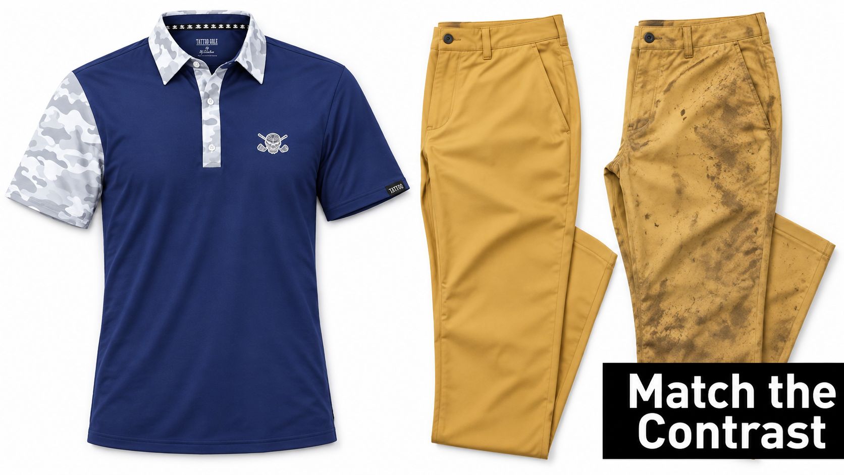
The failure that repeats most often with gold pants is a value failure: a dark mustard that sits close to navy in brightness, turning shirt and trousers into one heavy block. Hue gets the blame because it's easier to name. Value is what does the damage.
Value is how light or dark a color reads, and navy anchors the dark end. Your gold needs to read clearly lighter than the navy or clearly warmer than it, ideally both. When the pants land inside navy's brightness range, you lose the line at the waist, the camo loses its definition, and the outfit reads as two dark pieces that nearly matched by accident.
Saturation is the second test, and here the pants have to pick one job: support act or second headline. A muted antique gold sits beside this shirt and lets the camo keep the spotlight. A bright, highly saturated gold pulls the eye straight to your legs, and the print above the waist starts fighting for attention it used to own by default. Both jobs can work, but they call for different shades, so decide before you buy.
Why the White Camo Does the Hard Work
The white camo is the bridge color. Navy is cool and dark. Gold is warm and lighter. On paper they sit together awkwardly, and the white in the print is what connects them. It gives the eye a light tone to travel through, so the jump from navy to gold lands gradually rather than all at once. That's why a gold with a slight yellow-white undertone usually works beside this shirt. It echoes the warmth the white camo softens.
Run the common shades against that rule. Mustard brings enough depth and warmth to hold its own against navy, so it suits a player who wants clear separation between shirt and pants. Khaki-gold is quieter and safer, though it can drift toward beige in flat light and lose the point of choosing gold at all. Bright yellow is the riskier cousin: it passes the value test on lightness, yet its saturation runs so high that it wins every argument with the camo. Antique gold lands in the middle, warm enough to register as gold, muted enough to stay in its lane, and it's the shade I'd start with against this print. If you're standing between two rails in a shop and one option makes you squint, that's information. Put it back.
Finish matters just as much. Matte gold absorbs light and behaves like a normal trouser color that happens to be gold. Shiny or metallic gold reflects light, shifts shade with every step, and turns a printed shirt into part of a costume. On a golf course, matte wins almost every time.
Do This, Skip That
- Keep the camo as the only loud pattern: The shirt already gives the outfit its print, so the pants stay solid and let it work.
- Choose matte over metallic: A flat finish reads as a clothing color. A reflective finish reads as a material, and it fights the print.
- Tuck the shirt in: A clean tuck gives the outfit a deliberate line at the waist and shows the pairing was a choice.
- Match the belt to the pants' hardware: If the pants have brass or bronze-toned buttons, a belt with a similar buckle stops the middle of the outfit looking random.
- Keep the fit close through the chest and shoulders: The shirt's relaxed athletic cut sits clean across the shoulders without clinging, and that tidy line balances a bolder trouser below it.
The mistakes run in the other direction, and they're predictable.
- Don't add a second patterned pant: Houndstooth or paisley below camo gives the eye nowhere to rest, and both prints lose.
- Don't wear metallic lame gold: It reads as fancy dress beside a printed polo, no matter how confident you feel at breakfast.
- Don't introduce a third warm color: An orange visor or red socks pull against both the gold and the navy, and the white bridge can't rescue all three.
- Don't reach for cargo shorts or denim: On a course with a dress code they'll end the outfit before color even comes into it, and their loose shape undermines the polished top half.
Every do on that list removes a competitor, and every don't adds one. Pattern competes with pattern. Shine competes with print. A third warm color competes with the gold already in the outfit. Even fit competes: a baggy shirt over bold pants can't decide whether the look is smart or casual, so it reads as neither.
Rule of thumb: If more than one item is competing for attention, remove one.
Skin tone and lighting move the answer at the margins, so treat every shade as conditional rather than universal. A deep mustard that looks rich under bright retail lighting can read heavier under grey skies, while champagne that looks elegant outdoors can wash out under warm clubhouse bulbs. Judge the pairing where you'll wear it. That check takes minutes and saves a bad round.
How to Test a Gold Pairing Before You Tee Off
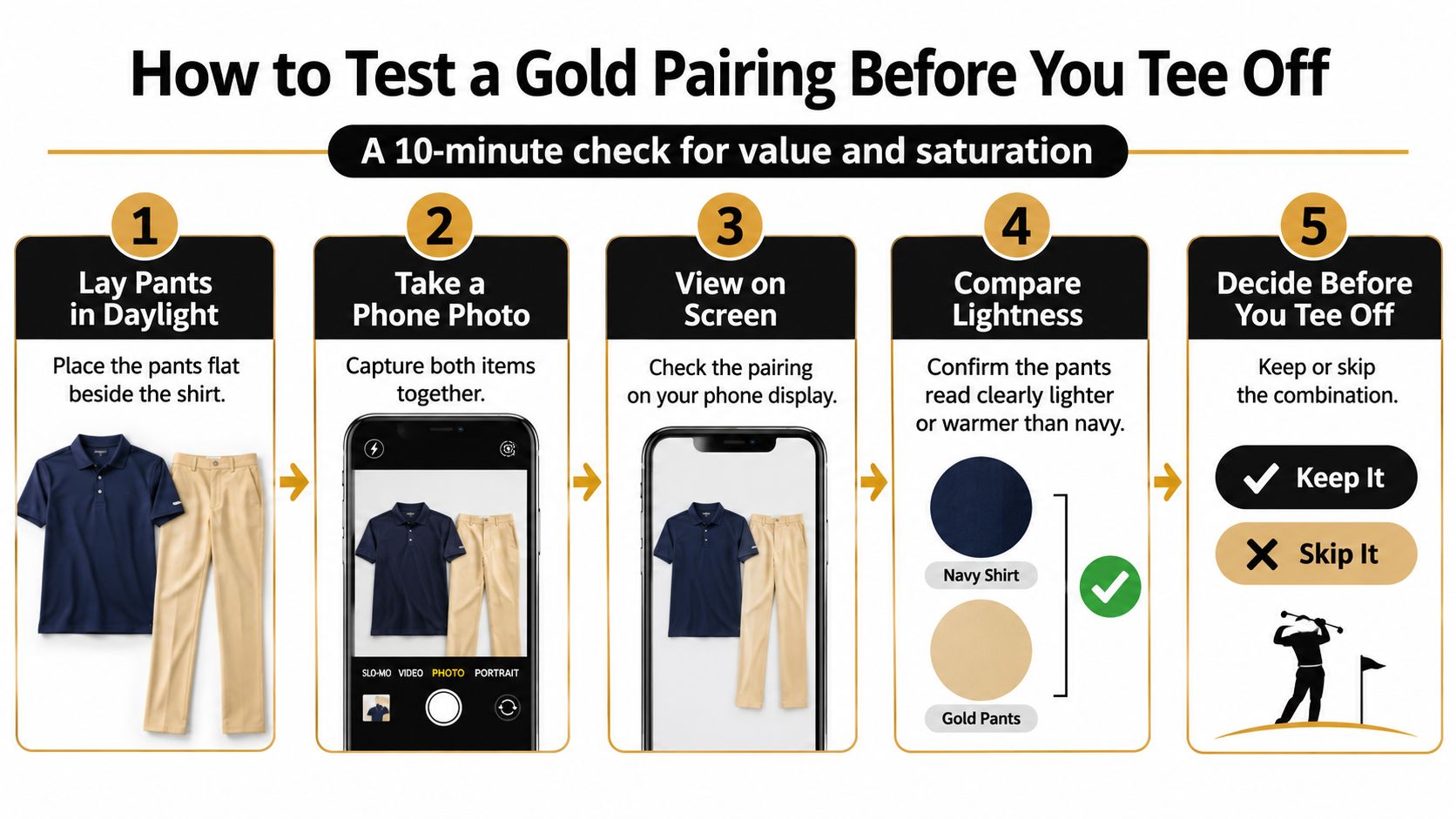
You don't need a stylist for this. You need ten minutes and a phone. Run the test at home before you buy a second pair of gold pants or wear the combination to a club where you can't change.
The Ten-Minute Test
- Lay the pants flat beside the shirt in daylight. Window light shows true color better than a bathroom bulb. A pass means the gold looks warm and distinct next to the navy. A fail means it looks muddy or nearer to brown.
- Take a phone photo of both pieces together. The screen strips out some of the flattery your eyes add in person. A pass shows three clear elements, navy, white, and gold. A fail shows the gold disappearing into the background.
- View that photo in greyscale. This checks value without color distracting you, a trick worth borrowing from anyone who thinks about what makes a good performance golf shirt in terms of how a garment behaves rather than how it's marketed. A pass means the pants read as a clearly different tone from the shirt. A fail means both pieces land at nearly the same grey.
- Put the full outfit on and check the seat, rise, and hem in a mirror. Color can't save a bad fit. A pass is a clean hem over the shoe and no pulling when you take a practice stance. A fail is fabric pooling at the ankle or a waistband fighting the tuck.
- Look at the outfit under overcast light. Most rounds aren't played in perfect sun, so judge it in the conditions you'll get. Step outside or stand away from direct light. A pass means the gold still registers as gold. A fail means it has gone flat and khaki.
- Check the club's dress code if you're playing a private course. Ten seconds on the club's rules page beats a quiet word in the pro shop. A pass means collared shirt, trousers, and no cargo details all clear the code.
Watch one edge case in particular. In the clubhouse at dusk, warm indoor lighting pushes dark bronze pants closer to navy, and the two can merge into one dark mass. If your plan includes dinner after the round, test the tonal pairing under a warm lamp at home. If the waistline vanishes, that shade is a daytime-only option.
If the pairing fails, change the pants shade. The shirt is the fixed element, so don't go hunting for a different shirt to justify trousers that aren't working.
Choose Your Gold Pairing and Shop the Shirt
Go with the pairing whose gold shade already lives in your closet, and match that shade to a row in the pairing chart above rather than buying trousers to fit a plan.
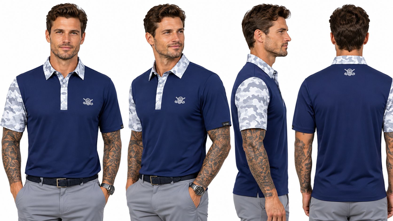
The VIP Cool-Stretch Men's Golf Shirt - Navy/White Camo sets a navy body under white camo accents, and that white earns the shirt its place next to gold. It sits between the navy and the trousers, so pale champagne reads clean beside it instead of washed out, and saturated mustard reads deliberate instead of loud. Judge your pants by value, saturation and finish, and the white camo does the bridging work that makes navy and gold sit together. The fabric is Tattoo Golf's 8 oz Cool-Stretch knit with 8% spandex: moisture-wicking, quick-dry, rated UPF 50+, and built to hold its shape through 50+ washes. It runs $69.99 in men's sizes S through 4XL.
The cut is a relaxed polo in true US athletic sizing. Order your usual size and compare chest and length against a polo you already own using the size chart on the product page. Size down only if you want a closer line: a closer cut sharpens the silhouette next to slim gold trousers, though it can look strained over a wider leg. Run the fit-and-light check from the last section before a course with a dress code, and keep the outfit to three colors on the first round.
Ready to put gold next to a shirt that can hold its own? Tattoo Golf builds performance polos with personality, including camo designs in a relaxed athletic cut for golfers who don't want to blend in. Visit Tattoo Golf to pick your size and build the outfit before your next tee time.
Share:
19th Hole Cocktail Collection Golf Shirts from Tattoo Golf